Special Features: Artists in the 2008 Whitney Biennial Address their Works
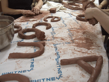
Fia Backstrom, photo of a clay workshop forLet’s Decorate, and Let’s Do It Professionally! (2008). Courtesy the artist
Fia Backstrom
What will you be showing in the Whitney Biennial?
The title of the entire piece is: Let’s Decorate, and Let’s do it Professionally! I am trying to respond to a situation which is pretty dense and spectacular, as well as speculative, I guess. I have invited the curators to make the majority of the work. We are going to have a workshop in clay, a pre-performance before the opening. The curators will make words in clay (derived from the keywords of Getty stock images). I am currently reading up on Kindergarten philosophies, especially a visionary Italian one called Reggio Emilia, on how to treat children as artists. The piece consists of a number of components, where my work mainly is to function as a hostess. I provide the background—wallpaper and tablecloth—for the social interaction, be it people or the relation between objects.
What happened at the workshop, and how will the resultant clay pieces be integrated into the Biennial?
The curators made words in clay (derived from the keywords of Getty stock images) and the clay pieces are integrated into the installation Let’s Decorate, and Let’s do it Professionally!
Amanda Ross-Ho
What will you be showing in the Whitney Biennial?
I will be showing new work, a site-sensitive installation developed specifically for the context of the museum and Biennial. Without giving away too much, the presentation is a constellation of sculptures, photographs, and an onsite architectural modification that considers economies of presentation, the mutability and materiality of context, and direct negotiations between image and object.
Kevin Jerome Everson
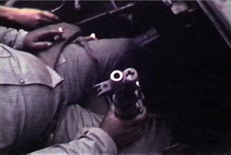
Film still from
Emergency Needs (2007)
Courtesy the artist
Kevin Jerome Everson
What will you be showing in the Whitney Biennial?
A film titled Emergency Needs, a 16mm film about the mayor, Carl Stokes, of Cleveland dealing with the July 1968 uprising.
The Cleveland uprising was one of several in the country that summer that pitted African Americans against police. My question is actually more about the form ofEmergency Needs than the historical events inspiring it; could you discuss why you hired an actor to recreate a Stokes press conference after the uprising, ultimately juxtaposing it in split-screen with footage of the real thing?
It’s all based on Robert Rauschenberg’s Factum I and Factum II. He painted the same painting twice. I was trying to find formal devices to take content out of my work. It’s more of a gesture or brushstroke then actually doing it. I figured that if I had two similar views then what would come across is its construction rather than what was being said or shown. This was my attempt. The new feature I’m working on, Rhino,will have more of these elements.
Joe Bradley
What will you be showing in the Whitney Biennial?
For the Biennial, I have created a suite of—I guess you could call them paintings, though there is no paint involved—multi-panel wall objects made with vinyl stretched over wood.
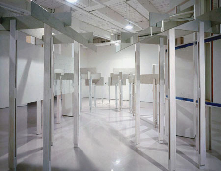
Heather Rowe
Installation view of On Returning (2007)
at D’Amelio Terras, New York
Mixed media
Courtesy the artist and D’Amelio Terras
Heather Rowe
What will you be showing in the Whitney Biennial?
The idea was initially inspired by a quote of Akira Kurosawa’s regarding people being unable to talk about themselves without embellishing. My piece consists of three skeletal wall-like structures composed of plywood posts. Each wall spans about 16 feet and has approximately 10 skinny posts unevenly spaced. These walls form two hallways (of the standard three-foot width) to pass though. Sandwiched between the plywood, inside the posts is sheetrock painted three shades of an ochre/mustard yellow color. Additionally, I have inserted fragments of used moldings and ceiling tin, and pieces of mirrors as “types” of embellishments. The posts attempt to effect three different types of spatial distortion and deception, each is pronounced in a related, but separated way. I also think of the posts as frames; they are sometimes clumped together or leave passable openings.
This sounds a bit like Bruce Nauman’s architectural manipulations of the late 1960s and early 1970s. Could you talk a little about how your piece expands on the Kurosawa comment you mention?
Yes, there is a slight connection to Nauman’s architectural works. However, since my work is quite skeletal, the piece can be penetrated in two ways: vertically (through the hallways) and horizontally (through the walls where space permits). The flow is more open-ended, where Nauman’s pieces are a bit more blunt in terms of how their presence evokes a sense of unease.
I wanted the piece to appear somewhat light even though the work is fairly large and imposing. It’s sort of like an architectural fragment or ruin which effortlessly sprung up in a space or even a thought that quickly passes in your mind. (That thought is then repeated two more times in slightly different variations.)
I would not necessarily say that I am expanding on Kurosawa’s comment. It was more like something I was thinking about during the conception of the work and how particular materials would function. The “decorative” elements become the embellishments. I chose materials with a sort of pathetic quality to them—ugly faux wood, relief wallpaper, found moldings, and linoleum “stone” floor tiles. The mustard and ochre colors add to the ugliness of the wall sandwiched between fetishized plywood. The mirrors placed throughout are also like extensions of the embellishments mentioned above. Both the viewer, the work itself, and the architecture of the museum become fractured in the piece and the design of the mirrors causes a certain materialism and de-materialism of the work.
