Monday Motivation | Is Your Resume Looking Good?
Kick off your week with Monday Motivation!
Tip of the week
The way you design your resume can be just as important as its content. Make it as easy to read as possible, taking advantage of bullet points, clear section headers, and as much white space as you can get. Stuck while choosing a font? Stick to the classics! They’re easy to read and easily recognizable by digital application systems. Not sure if the layout should be creative or traditional? Stick to traditional, unless you’re applying for a creative position. Just as you would tailor the content of your resume to the position you’re applying for, the visual language should also be in tune with the employer’s tone and culture.
This week’s highlighted jobs:
Manager of Development & Communications
FOR-SITE Foundation
San Francisco, CA
Consulting Curator of Experimental Performance
University of Chicago
Chicago, IL
Junior Accountant
The Moth
New York, NY
Executive Director
Apollo’s Fire
Cleveland Heights, OH
City Arts Program Manager
City of Portland
Portland, OR
This week’s highlighted opportunities:
NXTHVN 2020 Studio & Curatorial Fellowships Open Call
NXTHVN
New Haven, CT
Foundwork Artist Prize $10,000 Juried Grant
Foundwork
Brooklyn, NY
Open Call for Women Contemporary Artists
Pen + Brush
Worldwide
Contested Spaces: 2019 Harnett Biennial of American Prints
University of Richmond Museums
Richmond, VA
Find more jobs and opportunities on NYFA Classifieds.
This post is part of a regular blog series, NYFA Creative Careers. Let us know what careers you’d like to learn more about by visiting us on Twitter: @nyfacurrent and using the hashtag #NYFAClassifieds.
– Luiza Teixeira-Vesey, Designer/Marketing Associate
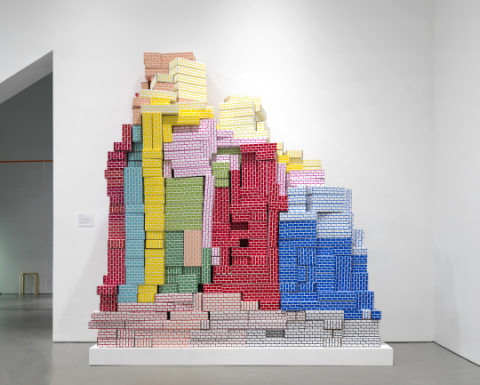
Image: Jennifer Schmidt (Fellow in Printmaking/Drawing/Book Arts ’17)


